Well, I managed to complete my animatic in time for the pitch! There were parts that I had to leave out or leave a little unfinished because I wanted content over detail, but overall I am extremely proud of my efforts. Here are the storyboards that depict the shots in the animatic. When the animatic is uploaded, I will post that here too. It's a big file, so I'm having trouble getting it on the net.
Sunday, 31 October 2010
Tuesday, 26 October 2010
Cool creepy adverts! A must see!
You remember that game called "Alan Wake" that I used as research not long ago?
Well cheeck out this amazingly clever adverts, using light to sell an idea.
Clearly here, the poster is placed on a building where it can match the way the sun rises and sets. It's basically a sun dial. It also suggests that when the sun sets, you will die. Very creepy!
This advert is clever. A light surrounded by a casing that controls its direction is placed at the bottom of the poster. At night, the light turns on. The light glows on to the poster, and creates the shape of a coffin! CREEEEEPY
Again, this is an example of clever lighting, used in a way to send out a message to an audience. People forget how useful lighting can be, and I want to make sure that I try and use it in interesting ways for my work.
Friday, 22 October 2010
Progress with pitch so far...
Okay, well I think I'm roughly under half way through my animatic, which is pretty good, but I still have a fair bit to do. I've been editing it in Final Cut Pro, which hasn't been as difficult as I thought it would.
I was fortunate enough to come up with a few ideas for my girl character whilst at the Gym today. I was watching the tv thats inbuilt into some of the machines. As I was watching the Gymnastics on channel 2, I realized that this would be a great skill for my girl character to have to rival the monster's strength. Her dexterity and agility would definitely be good enough to concur the monster.
It may be tough to animate, but it would certainly add a spark to the girl's character.
I also originally had the girl use a yoyo as a weapon, but I was inspired to change this weapon to a skipping rope. It is a lot more girly, and would probably pack more punch.
Wednesday, 20 October 2010
Coincidence?
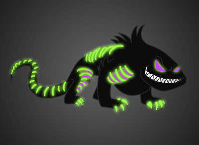
My monster character is starting to suspiciously resemble an existing character many people know already:
Toothless from "How To Train A Dragon"???
What do you think? I'm kinda not worried about the close resemblance. I like to think that I am unconsciously inspired by that film. It is absolutely awesome, and features many lizardy friends who would provide some excellent research for my work. My monster is the evil version of Toothless, minus the wings and plus the weird glowing tattoos.
Anyway, above is a mini preview of one of my animatic/storyboard shots.
I've been working hard on a few of the scenes for my story. I'm trying lots of different things out., including camera angles and shots. I've also tried to be flexible when posing my characters. I tend to sometimes restrict my drawings to being rather flat, but I feel I have done well to avoid this.
As far as the victim is concerned, I have done a couple of sketches that I'm not altogether happy with, which I will upload soon.
Tuesday, 19 October 2010
Character Design - Brat
For my monster's "victim", I initially thought of having a standard little boy character. But now, since I'm going to have two "little monsters" in my short film, I will need to deliberate again about how to alter the look of my child character.
This time, he or she is going to be rather spoilt and mean. I am now erring on the side of creating a character not too dissimilar to Angelica from "Rugrats", or Darla Dimple from "Cats Don't Dance"
Monday, 18 October 2010
Komodo dragon footage
They are a force to be reckoned with! I found out quite a lot of info from these videos, both visually and factually.
Ideas Storyboarded
Hey there!
Here's some written and sketched ideas I came up with for you to see. I'm sorry about the quality of the images and the missing annotations, the scanner kept messing up. I'll retype anything that is missing.
I had a nice meeting with some people in my class who have been interested in being group mates (Michelle Vinall, Steve Pender, Clym Smith, and Fahran Younas). I showed them these ideas and they warmed to idea 3 and 4.
I am thinking of combining the two ideas into one.
I also think that it would be funnier if the child that fights the monster away is a girl instead of a boy. So I'll need to do some new drawings to come up with a good girl character.
Here's some written and sketched ideas I came up with for you to see. I'm sorry about the quality of the images and the missing annotations, the scanner kept messing up. I'll retype anything that is missing.
Ideas Brainstorming
Idea 4
I had a nice meeting with some people in my class who have been interested in being group mates (Michelle Vinall, Steve Pender, Clym Smith, and Fahran Younas). I showed them these ideas and they warmed to idea 3 and 4.
I am thinking of combining the two ideas into one.
I also think that it would be funnier if the child that fights the monster away is a girl instead of a boy. So I'll need to do some new drawings to come up with a good girl character.
Friday, 15 October 2010
Monster Tattoo Trials
I've been having a lot of fun with the glow effects in Photoshop! Here's some examples of what I've done. I'm not mad on some of the patterns and shapes I've given this little fella, but I like the way it makes certain areas of his body stand out more.
I also tried outlining his body with a black glowing line, which made this:
I kinda like it, though I think it would need to be toned down a bit, so that it doesn't hurt people's eyes!
Lizard study
Just having a look at Komodo dragons for my Monster character designs. Here's some nice images that I like:
I think my monster will probably not have that long snout, but I like the heftiness of it, and the anatomy.
Here's the skeleton of a Komodo:
Looking at the Komodo will help if we need to rig the character.
I think my monster will probably not have that long snout, but I like the heftiness of it, and the anatomy.
Here's the skeleton of a Komodo:
Looking at the Komodo will help if we need to rig the character.
Character Design progression
My drawings of the Monster are taking on a rather lizard-like stature. I'm trying to avoid making the lizard look like Randall from Monsters Inc. I really like the first design on the second row. I think I may develop it a little more
... Which is what I have just done!
Please click the image for a better view of the images and notes
Here's a blank coloured version of my present monster idea. I rather like it. I have composed it in a similar way to Darkjak, as you can see. I'm gonna mess about with some markings later.
I just want to clarify that i don't want to copy Darkjak's designs, but I want to toy around with the tattoo idea a bit, (the glowing effect at least) so I can give this character more oomph
Environment Design
Here are some Photoshop drawings I have drawn of the house and the bedroom:
(Sorry this is a little pixelated, I wanted to show it fairly big so you can see the detail.)
Above is a panning shot from the roof of the house to the window of the bedroom. I used my own house for some reference. We have a pipe that runs down the house like that, and I figured this would be a good way for the monster to climb down to the window.
Here's a shot from a mid level camera angle of the bed looking away from the wondow. That's "meant" to be a mirror on that chest of drawers. The lamp is subject to change if I design a good lantern toy to replace it. The carpet is designed to lead the eye to the bed (hopefully the stripes cause this to happen) The same can also be said about the duvet too.
This is a slightly better wide shot of the bedroom. I included a dolls house and monster toy, which are meant to resemble the house this scene takes place, and a slightly friendlier version of the monster in this story. He is meant to slightly resemble Sully from Monsters Inc.
The cupboard is to the left of the bed through that door. I wanted it to look like a fairly unassuming passage to somewhere, which would turn out to be a place where someone could hide (for one of my ideas for the story)
The kite on the wall is taken from one of the bedroom photos I found in my research. It is meant to look sinister in the dark.
The trunk is there as a "step" for the monster to climb from the window.
I will probs add a few more toys to this scene. I will need to think how the textures will tie in to this idea if this is going to be made in 3D.
Thursday, 14 October 2010
Character Design Thoughts
There's an artist on Deviant Art that I really like called Emma Sarkela aka "Darkjak". On the train earlier I remembered that she did some really cool monster designs that I really like. Here are some images I found:
I love the idea of having glowing "tattoos" though maybe I could use them for my monster in a different way? I still need to do some revamped designs, but I just want to clarify that this is a direction I am definitely considering. I have always figured that the illuminous look might work quite nicely for the monster, especially if the scene itself is very dark.
Sunday, 10 October 2010
Friday, 1 October 2010
Research - Alan Wake (and other notes to do with light)
Today I bought this game for a bargain price, and couldn't resist playing it. And boy oh boy am I glad I bought it! It is deliciously spooky and has a fantastic plot that really makes your brain work hard. Despite the fact I have only played this game for a few hours, I already feel that this has some elements that will help me out.
For a start, check out some of the gorgeous landscapes the designers have crafted in the game. JUST LOOK AT THEM!
Don't they look pretty? The environment designers have really worked hard to create that lovely forest scenery. When you play the game, you really feel immersed in the town and believe in it. It looks and feels so real.
But what interests me the most is when the sun goes down and night time surrounds Mister Wake. This is when the real fun begins
I just want to emphasize that each of these night scenes use light ALOT. The game is based around the use of light and dark. The constant battle between the two forces is significant. What I really like is the sparks that fly of the birds when they are vanquished. I also like the eerie silhouetting of the buildings and miscellaneous objects.
Using light often helps with storytelling too. I feel that it is important for me to take into account how I should light my night time scene
I figured that the main light source would come from the moonlit window(s), a night light (?) or reflective surfaces. I also have considered that maybe there could be a toy that is active before the monster arrives, emitting a light and music. Here are some images of what I was thinking of:
Children's toys are often used in scary films, because they reflect on the innocence and vulnerability that you have as a child. I think the gold carousel just above this text is pretty scary looking. Though I want the light to shine out of windows that would contain the spinning characters, kinda like this -
... But maybe with coloured windows instead.
Subscribe to:
Posts (Atom)