One of the paths of research I decided to go down led me to that fun and humorous Pixar film, "Monsters Inc". My concept closely resembles the film - A child being visited by a monster in the middle of the night, a story which ends in friendship. This film is one of my favourites, so naturally I had a lot of fun looking into it for my project research.
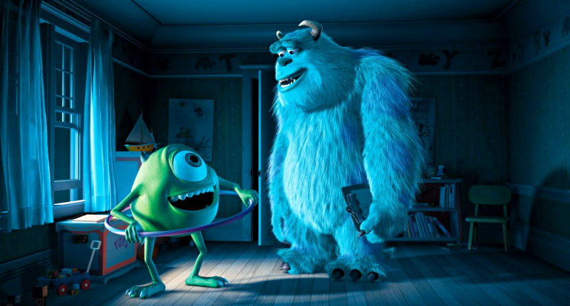
The film stars two monsters who both work for a child-scaring monster corporation. Sully, the larger hairier character is the company's top scarer, who is actually a gentle giant when you get to know him better. Mike is his silly, small green friend who helps Sully with the tedious jobs that need to be done. They accidentally discover a little girl who has entered the monster world, and so try to conceal her from harm.
The parts of the film I want to concentrate my efforts on are the scenes within the rooms of the children that get visited by the monsters. The first scene in the film shows the training of a student monster in a fake child's bedroom scene created by the monsters. It gives the audience a clear depiction of what Monsters Inc is all about with clarity.
I want to study the way the Pixar Environment Designers cleverly assembled this scene, and find ways in which I can utilize some of Pixar's techniques for my own work.
The following two images show the contrast between the lit and unlit bedroom. To me, the light warm, yellowy colours represent the presence of the child's parents, and the security that they give to the child. The shadows naturally shy away from the light and away from the direction of the parents' voices. The imagery on the walls and the toys on the shelf are childish and colourful.
 However, when the light is quenched, the shadows jump to the left and the colour is drained from the shot. It has become a lot more blue, which creates a nice stark contrast to the warm yellows and oranges from earlier.
 I'd like to try and have a similar part in my story where the light, colours and shadows help change the atmosphere from comfort and warmth, to mysterious and slightly spooky.
 Above is a wide upper shot of the scene, focusing on the bed. You can see that the only source of light is coming from the window to the right. The shadows are still all cast to the left. The scene is predominately made up of blue and washed out yellow colours. The bed, the doors, the curtain, and the skirting boards are whitish blue coloured. The skateboard stands out boldly in this scene, as if it is trying to point towards the right, where the monster will soon appear.
 Ho' shi'!!! Yep that's a mighty scary shot! But what makes this so creepy? The fact that the monster is silhoutted by the lighting behind him contributes to the scare factor. You also have a fairly extreme close up of the boy's face, so you can see him slowly react to the terror awaiting him.
There is also a stark contrast of colour within the monster's eyes. Check out that reddish pinkish orange tint! The viewers would be drawn immediately to those fiery eyes of his!
So there you go. That's my analysis of this scene. However, I am nowhere finished. I would like to look at the designs of the monsters too. I have toyed with the idea of designing either a ghost or a monster to be the antagonist in my animation plan. Therefore, I should take a look at the design process Pixar went through to get to their final designs.
Unfortunately, I don't have access to the Monsters Inc Art Book, but when I get back to college, I will try and find it, and use it to research the character design a bit more.
However, I will say this: Sully and Mike are more personified, so that we can relate to them more. They have contrasting colours (green and purple generally contrast really well) and are made to look kind and not too grotesque. I also read on this blog >>> Advanced Character Animation that Randall, the evil villain in the film, is made to look and act nothing like a human, and have more of a reptilian manner about him.
The shapes of the monsters also reflect the personality they have. Sully is kinda a sturdy square shape, where as Mike is a friendly round shape. Their silhouettes are easily recognized as well, because they are so different and unique.
So I need to think carefully about how I design my ghost/monster character. If I want my two main characters to get along, I should try and make them relate a lot to each other. I need to balance the contrasting and comparative elements of my character designs.
No comments:
Post a Comment